The Jewish Education Project Brand Refresh
+ Prospectus
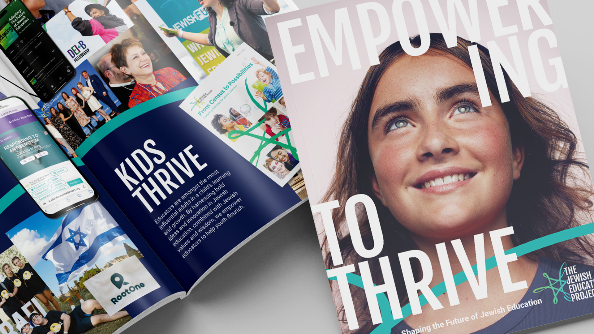
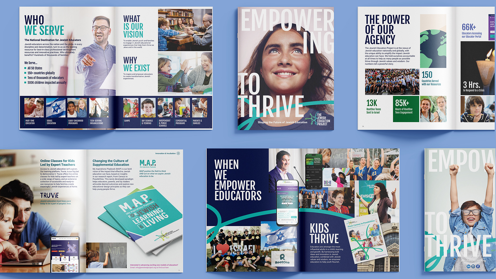
Created a thoughtful refresh of an expansive brand with multiple sub-brands along with a 32 page prospectus report providing an overview of the organization and a platform for the launch of their new brand.
SERVICES
Whitepaper
Branding
Content Marketing
Social
Ads
Design
The main objective was initially just to design the prospectus report. But as we began the conversation with The Jewish Education Project it became clear that they were frustrated with the current state of the brand. It was feeling outdated, disjointed and lacking a cohesive positioning threadline connecting all of their sub-brands. They needed a brand refresh that maintained existing brand equity but was more easily identifiable, stood out in their field and organized their family of brands into easy to understand systems and conveyed their brand story clearly and compellingly. The prospectus provided a perfect opportunity to explore and define the new refreshed TJEP brand to their audience.
+ Read More
The Jewish Education Project is an education non-profit serving 150 countries and impacting over 500,000 youth annually with a broad variety of programs and initiatives including; online learning tools, conferences, fellowships, donor programs, thought leadership pieces, podcasts and multiple smaller programs.
TJEP sought a brand refresh that would essentially clarify the brand. Together we would evaluate the brand and it’s assets to focus it. Keep what was working or necessary and clear out everything else. Refine what remained and add what was missing. Then tie it all together in a way that builds on itself and is easy to apply.
brand Refresh
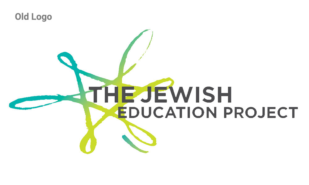
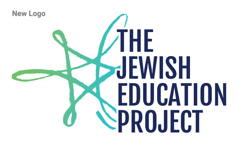
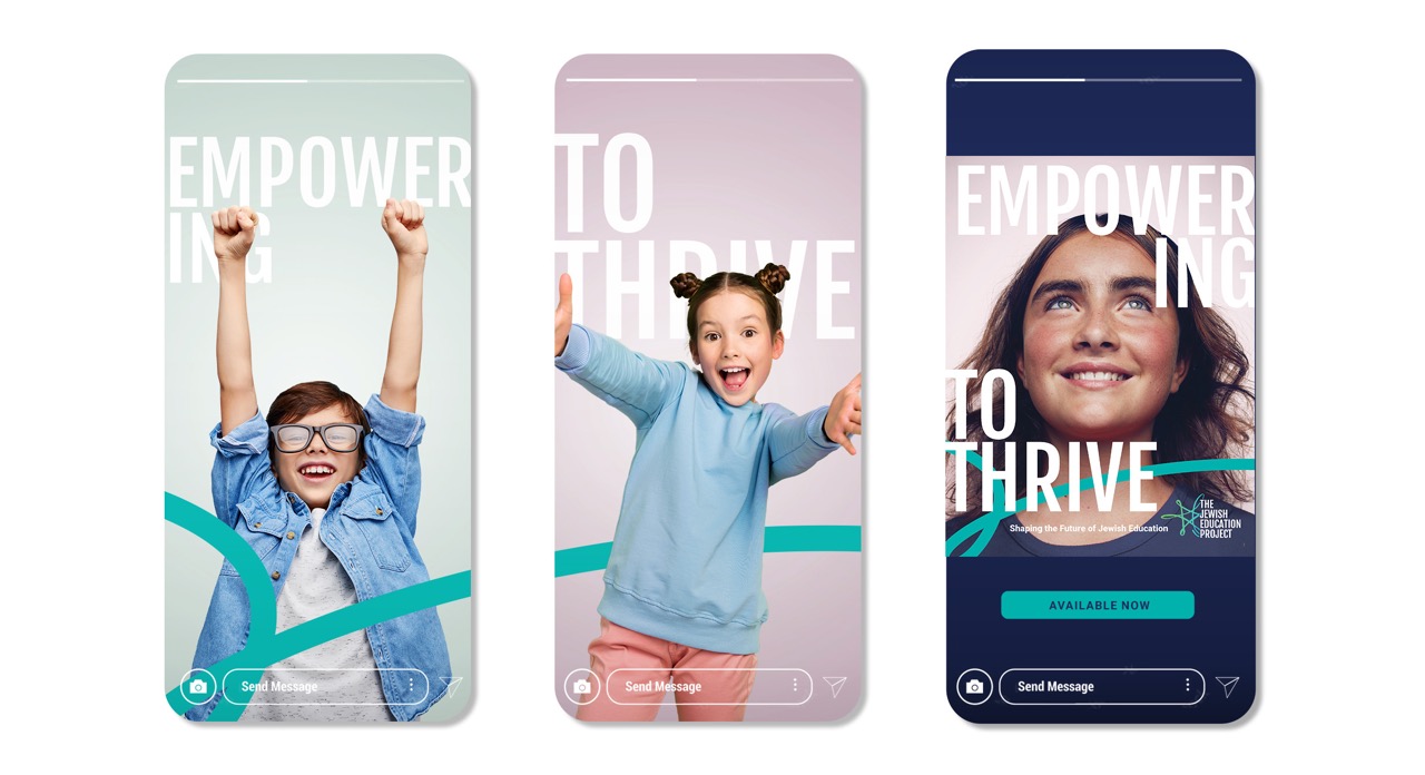
The logo was updated with a new modern type treatment while the logo icon, the star, remained but was narrowed to be more symmetrically weighted with a refined color palette. A new brand color system was created using their original primary brand colors but expanded to include complimentary shades that provided structured & distinction for new materials and passed Web Accessibility standards. Updated brand fonts, alongside a new brand icon and usage guidelines, were developed to further aid in new content creation. The sub-brands were thoughtfully organized into distinct categories, accompanied by design guidelines tailored to each.


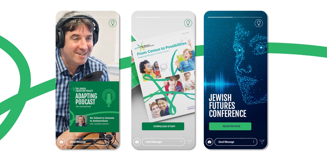


sub-brands
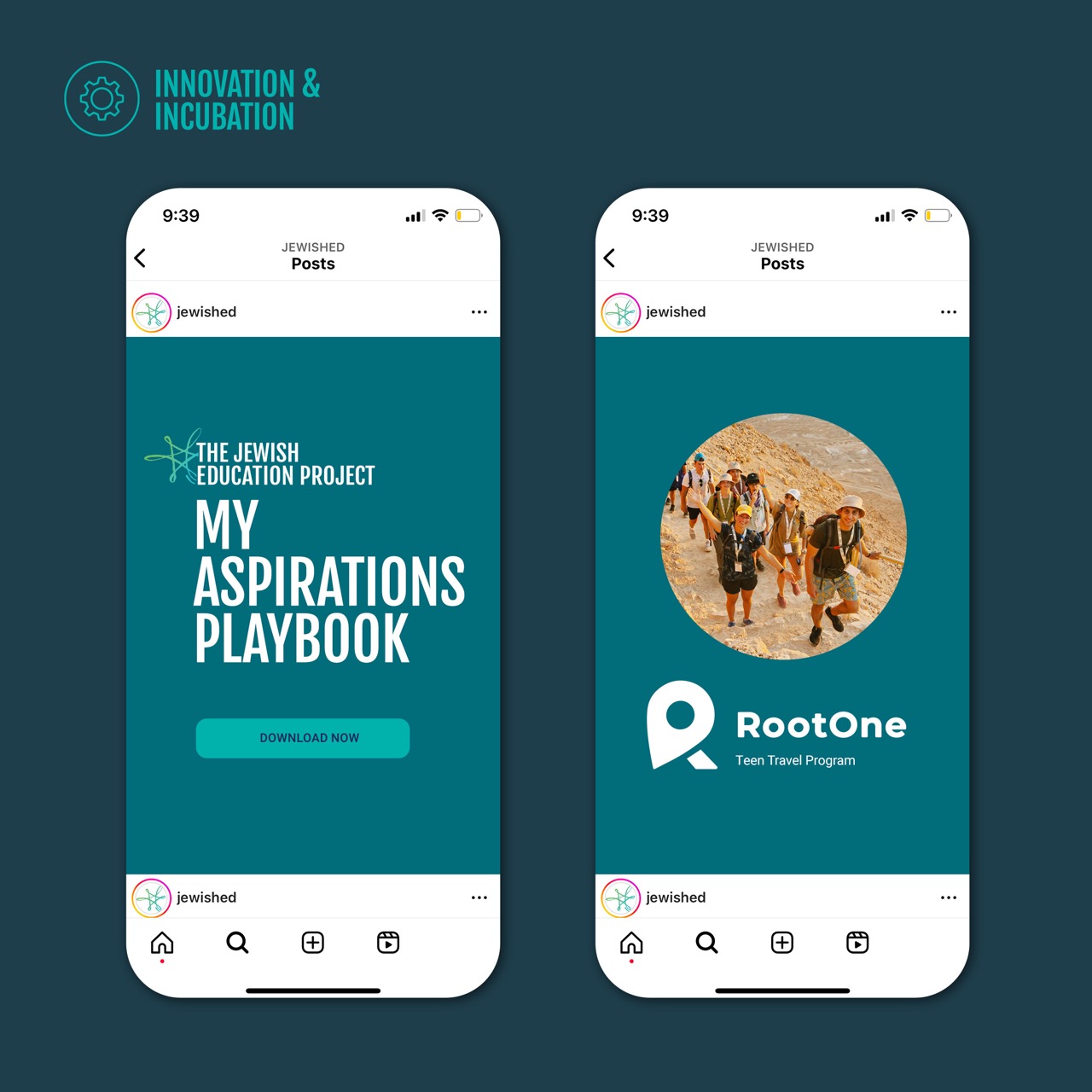
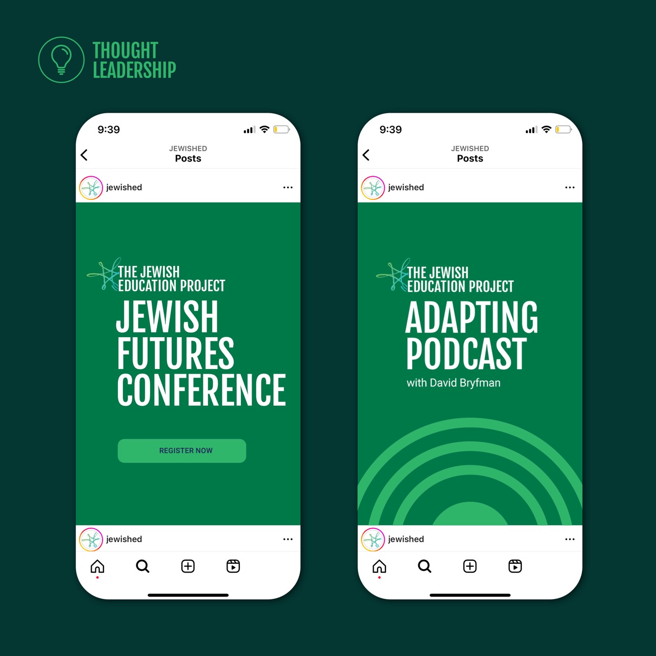
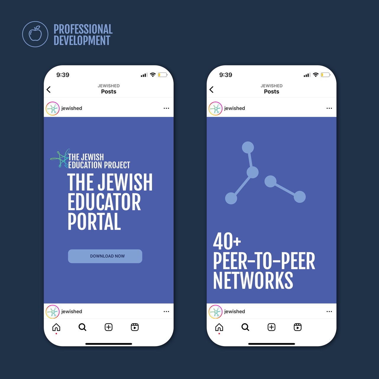
Working with the in-house marketing team we identified 3 buckets to organize the programs. Each was defined with its own color palette and icon for distinction while still laddering up to the parent TJEP brand.

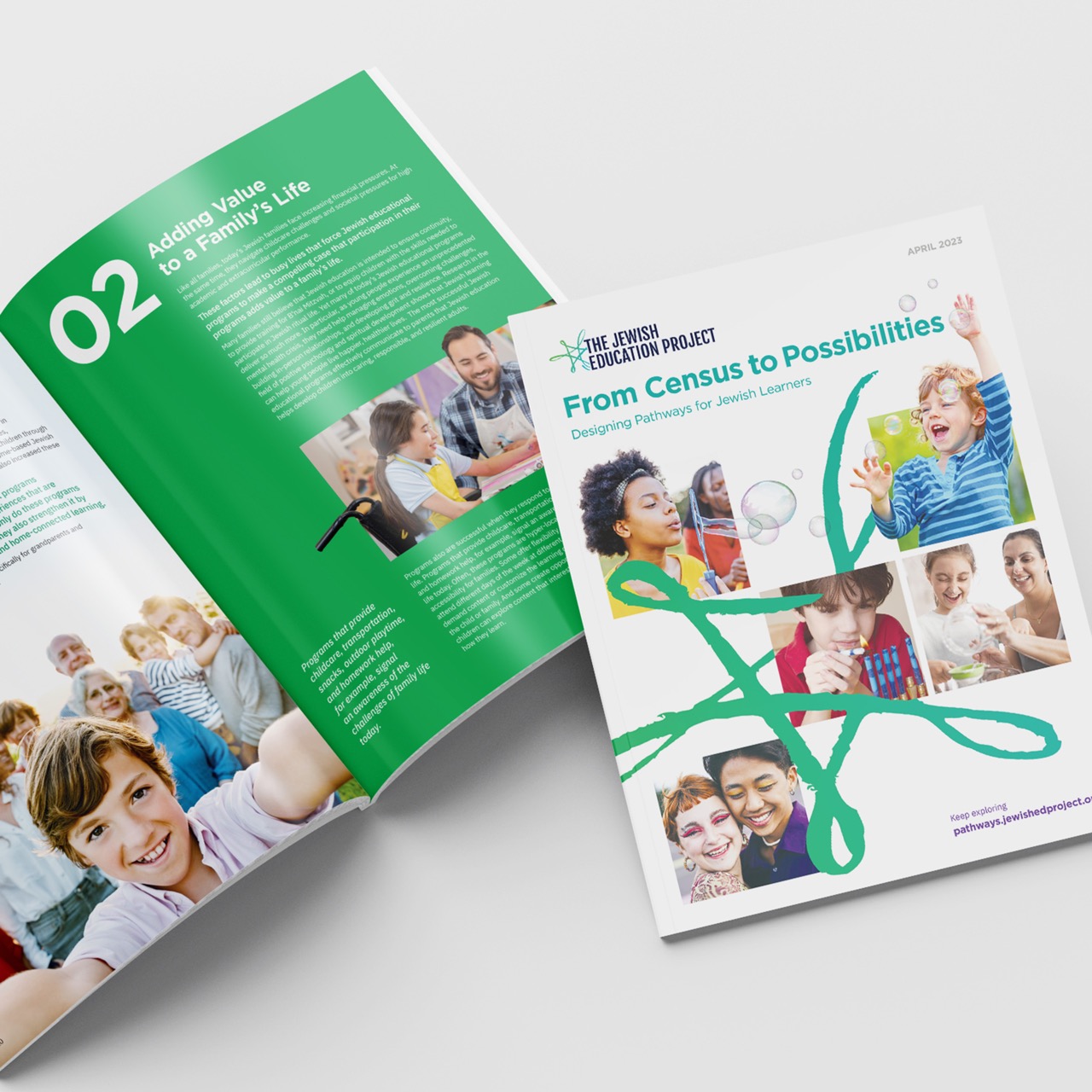

Prospectus
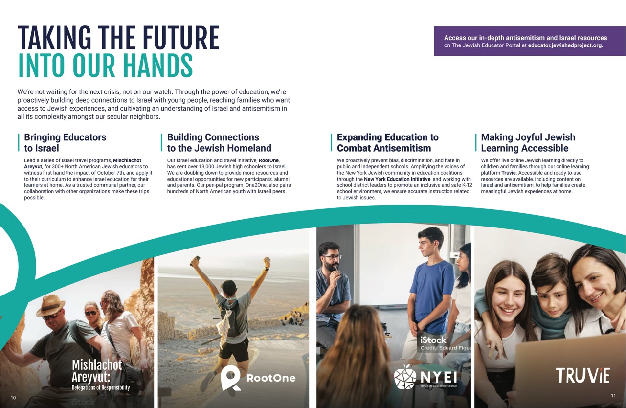
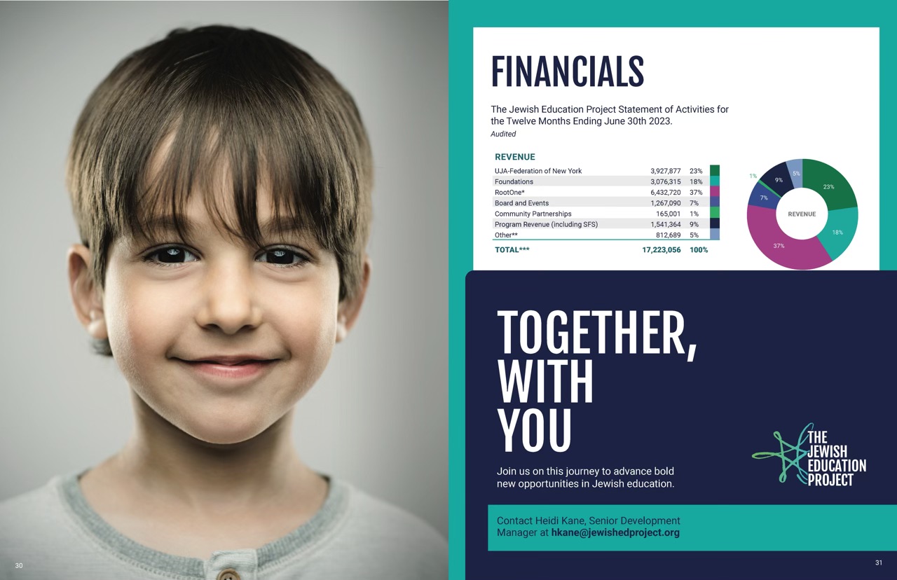
Working across their in-house marketing team, internal departments, and executive management we distilled the organization and its’ many branches into a single voice with clear purpose and a strong positioning that embodied their unique approach, values, and modern ambitions. Then crafted their 32 page prospectus into a manifestation of their brand story and exploration of their depth of work.

results
“AMAZING”
Managing Director, Marketing and Communications, Karen C.
“So excited, it looks amazing!”
“STUNNING”
Exec Director, Susan W.
Referred to the work as “STUNNING” (in all caps) and perhaps the best storytelling she’s ever seen at TJEP.
related projects
Decoding Gen Z Report + Campaign
SERVICES
Whitepaper | Branding | Content Marketing | Social | Ads | Design
OVERVIEW
The report was ultimately the keystone for creating a seamless omnichannel marketing experience that would capture attention, engage the audience, and ultimately drive traffic to a landing page for lead generation.

